Tuesday, January 13, 2015

Camera Buying Anti-Advice


People often ask "enthusiast" photographers for advice on which camera to buy. This can be a good thing or a bad thing. One characteristics of enthusiast photographers is the tendency to place a higher value on certain aspect of both gear, and the images produced, than the average person does.

For instance, an enthusiast may put so much emphasis on image quality expectations such as resolution or high ISO noise levels that he isn't thinking that his friend Staci really does only need enough camera to get pics of her kids suitable for uploading to Facebook or Tumblr and maybe the occasional print to hang on the wall. A 'full frame' dslr or ILC that costs  between $1500 and $2500 just for the body, and takes lenses the size of artillery shells may be the enthusiast's cup of tea, but is a bad idea for Stacy.

This brings up the other idiosyncrasy of many enthusiasts: they want to believe they are on par with professional photographers, so they tend to want to own gear that pros favor. This is one reason why Canon and Nikon are so popular. They have been the brands of choice for pros for decades. Part of this is because they have such a wide selection of lenses, something of great importance to a pro who may need a 600mm lens for photographing sports or wild life (and can justify the $10K price tag). Yet it's not an issue for Stacy or  95% of other camera buyers, since lens selection is pretty much moot.

I say this because data indicates that roughly 80% of all photos are taken in the focal length range of around 35mm to 85mm EFL (effective focal length compared to 35mm standard). That's pretty much the same range that the average kit zoom that comes with even an entry level DSLR or ILC covers. It's definitely within the range of zooms found on compacts and "bridge" cameras. This is the case because most people take photos based on what they see with their eyes, and this range of focal lengths covers the angle of view of human vision. (Sure, if Stacy wants closer photos of her kids playing soccer, that mid range to telephoto zoom will be necessary, but again, even entry level cameras can be bought with a zoom in this range.)

My point is that take what an enthusiast tells you about which camera to by with a grain of salt. That grain should include considering whether you are going to be taking photos at ISO 3200 or 6400, or that you want to print at 30 by 20 inches. Don't let the oft-heard justification for buying Canon or Nikon, "They have the best selection of lenses" become a factor unless you really do plan on spending thousands of dollars on long telephotos, or lenses with very large apertures, or specialty lenses like tilt and shift wide angles. Those are tools for pros and serious photographers who need them to capture certain images, but not reason for the average camera buyer to invest in a system.

I'm not saying don't buy Canon or Nikon. I am saying that there are better ways of making a choice of camera than what Uncle Irving the family camera guru has to say (that is, if he harps on a particular camera or brand by tossing out terms such as "better IQ" or "Great high ISO noise performance" or lens selection.) All the current major brands-Canon, Nikon, Sony, Olympus, Pentax, Samsung, Fujifilm-make cameras that are pretty much equal in features and results for the average user. They all produce a sufficient variety of lenses for their DSLRs and ILC cameras. They have a good selection of compact and "bridge" cameras available.

So how do you choose?

Simple, really.

Think about the photos you most plan on taking and compare which camera features will make it easiest to take those photos. Want to take photos of your prize winning gardening efforts? You can easily get by with a relatively inexpensive entry level DSLR, ILC with kit lens or bridge camera. Have a daughter whose a future FIFA star? Then you want a camera with a longer zoom lens, good continuous focus capability and a higher burst rate. Want to take video as well as stills? You would better off with a bridge camera or mirrorless ILC, which make video easier and more effective, than with a DSLR.

Also consider aspects of owning the camera some people overlook. Do you want image stabilization, and if so do you prefer the lenses do it or have it built into the body. Sensors can collect dust: how effective is the self-cleaning system of the camera? Does the camera have any special requirements such as only using certain types of memory card, or is the battery life poor and extra batteries expensive. Size: is the kit going to end up being bulkier and heavier than you want? (This is especially problematic with mirrorless systems where the body is quite small, but the lenses are still the same size as DSLR lenses) Also do some research into reliability and repair options. A great camera that has a poor service record is just going to lead to frustration.

 At this point you probably won't find a lot of difference between the cameras, so...

As much as possible, pick up and handle the cameras you are considering. Do you like how it feels in your hand.? Are the controls easy to use and understand? Can you get the camera set up to capture images of a particular type of subject or situation without a lot of fuss? Does it fit your budget?

Finally, be willing to apply the concept that "less is more". Do you really need that $1500 DSLR kit when in fact you will do just as well with the $800 kit, or even the $400 bridge camera?

The bottom line is whether you feel comfortable with the camera, both in use and as an investment. Unless you plan on making photography a serious hobby or career, you may find that the cheaper camera gets plenty of use and is more than adequate. Conversely, a lot of people have expensive DSLR kits that sit in the closet except on birthdays and holidays because they find their smart phones do the job just fine the rest of the time.

Buy the camera you enjoy trying out in a store, even if Uncle Irving wouldn't approve and the sales person wrinkles his nose at your choice. It's your money being spent, and you using the camera, so to make the most of it get one you like using. Things such as image quality and lens selection are pretty much equal between brands for most people.

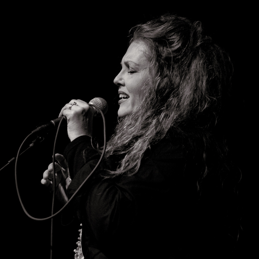
As a working photographer who specializes in performance photography, I have specific requirements that the average person doesn't when it comes to what my gear is able to do. The fact is that my current gear is "adequate", but with plenty of room to upgrade (which I am budgeting for in the near future.) Yet, what is "adequate" for me is overkill for a lot of people. My primary lens, as seen in the photo at the top (attached to my most used camera model), costs more new than most people need to spend on their entire kit: camera body, 2 kit lenses, cards, batteries, bag et al.

Marketing departments work hard to make people think that by buying a camera body or brand that is used by pros, their photos will reflect that fact. This isn't the case. Sure, the larger sensor and better optics of a DSLR or ILC will definitely improve the technical aspects of your images over a smart phone or compact point and shoot. That's only part of the equation though. A bigger part in your enjoyment of photography, and in producing images you are proud of and others enjoy seeing, is YOU. The more you enjoy using the camera you have, the better your photos will be.

I, and every other working photographer, started out the same way, producing photos I loved. Over time and with intent on my part, they happened to become good enough for others to start paying me for them.  Many pros will tell you that while they may tote $10,000 or more worth of gear in their bag when they work, they turn to a cheaper, simpler kit when they are on vacation or taking photos of the family.

Right now I use gear that some would consider "amateur" because the cameras lack certain features of top of the line pro bodies.  Those pro bodies don't necessarily make the photos themselves any better: they simply  better facilitate the process of producing the photos under a wider variety of conditions, and according to the demands of a professional's way of working.  Yet I take many personal photos with my smart phone, a Samsung Galaxy S3, because it's convenient to have with me, produces good results, and lets me process the photos and upload them online all in the same device.

Whether paying extra for the capabilities of higher end cameras is worth it is up to you.

Sunday, January 11, 2015

In the Land of the Blind...


Years ago I read an H. G. Wells short story called "The Country of the Blind". It tells of a mountaineer named Nunez who literally stumbles into a Utopian, secluded valley populated entirely by blind people. They had started out with sight, but disease robbed their newborns of vision, and after fifteen generations they had even forgotten what having sight was like. They had thoroughly adapted to the lack of sight, just as cave dwelling creatures do.

Nunez naturally thought his ability to see would allow him to rule and help the people. Instead, he was confronted with doubt and derision, as people thought he was making things up or even deranged when he tried to describe what it was like to actually see. No longer able to deal with the frustration of the attitude of the villagers, Nunez acquiesced and gave up his efforts to convince people he could see.

 He fell in love, but his request to marry was refused by the village elders because they thought he was ill due to his talk of seeing. It was suggested that his eyes be removed, since they were judged to be the cause of Nunez's illness. In one ending of the story, his attempts to warn the village of an impending rock slide were dismissed, and he barely managed to escape with the woman he loved before the village was destroyed.

The story was meant to be an allegory for the small-mindedness H.G. Wells saw in Edwardian England. Many people at the time only accepted a certain version of the world that fit their comfortable existence. Ideas and concepts which fell outside of their views were dismissed as unrealistic flights of the imagination or the rantings of the insane. People demanded that order be observed and that proper members of society would help to maintain the status quo.

Creative people are also "people of vision" . The reverse is also true. It's just as visionary and creative to come up with a new way of building a home that is more environmentally friendly as it is to develop a style of music that is outside of conventional expectations. Both are also equally valuable to society. Both are also subject to the same lack of vision that plagues the majority of people within most societies.

"The Country of the Blind" offers the same the sort of scenario creative and progressive-thinking people constantly find themselves in. Whether it be the style of a painting or the message behind the words of a song, the "seers" of the world, who express their vision through the arts, are often subjected to either derision or condescension.  Just as with the story, those who lack vision are oblivious to the fact. They have accepted their version of the world not only as normal, but as the correct and preferred version. Anything outside that version of the world is an anomaly to be disregarded, or even destroyed if it becomes an annoyance.

The irony of this is that the next generation often embraces the very same concepts and ideas that a previous generation rejects as "crazy". It's a sad irony, though, because they then turn these new ideas into staid convention, robbing them of the life and originality that made them a vision in a vision-less world. By reducing the novel and creative to the level of the mundane, we then take it for granted. We lose sight of the value genuinely creative people and their works have in our society. We end up wanting the 'product', because it has become a valued part of our lives, but we don't want to properly recognize and support the producers of those products.

We see this in things such as the cuts to music, drama and arts programs in our schools. It's evident in how demand to pay less and less for the music, images and artwork that we use to enrich our lives. The worst part about his is, we extend this lack of appreciation for our visionaries to those who see solutions to practical concerns such as racial, social or economic issues.

It's no coincidence that many truly creative people are also forward thinking, and deeply passionate, about social issues. It comes with having a mind and spirit that are constantly seeking, forever dissatisfied with the here and now because that mountaintop leads to a vista that cannot be neglected. The desire to discover or produce something new, something creative, is unrelenting to those with vision.  Creative people seem to be passionate, more caring, about things others aren't. Why is that?

Is it a matter that creative people naturally care more, or do they simply find ways to express what they care about in more passionate, attention-grabbing ways?

Does being creative make you more caring, or does caring more elicit greater expression of the creativity that is inborn within each one of us?

Whatever the answers may be, the real issue is why society tends to dismiss the most creative people and their ideas, at least until it's proved there is a profit to be had. In so doing we stall progress technologically, socially, economically et al. We rob ourselves and the entire world of advantages that creative endeavors offer, simply because we either cannot or will not apprehend the value of it until well after the fact.

 For instance: in 1987, Apple came out with a device that was unique at the time, the Newton. It was a computer that you could hold in your hand, with a touch screen that allowed you to do many of the same things you could do on a bulky desktop or laptop computer. It failed commercially. (Interestingly enough, 20 years earlier people accepted such as device as normal in the scifi series "Star Trek".) Yet now the iPad and other tablets are ubiquitous in our society, and are surpassing conventional computers in sales and usage.

That is the conundrum of being creative in a mundane world: Right now, people ask "Why?" while in the next decade, or the next generation, they will be asking "Why not?". What they once rejected, they now accept, even demand, as a part of their lives because someone came along and convinced someone else that money could be made from the idea. Nicholas Tesla offered the world free electricity. Thomas Edison offered the world electricity for a price. Look at where we are at now.

The history of art is filled with men and women who died penniless, but now collectors are paying millions for their works. It's the height of frustration to realize that a song or a novel or a photo or a painting that is earning little or no money right now could become an iconic masterpiece in the future, simply because someone decided (often after the artist is dead) that they are willing to pay a premium for the work.

Like Nunez in the H.G. Wells story, people with creative vision have to deal with being viewed as liars or mentally ill by a society which lacks vision. The saddest part of this is that the society could benefit greatly from heeding the words of the creative people who are the subject of so much derision. Consider how people with vision and creativity feel when they are left with the choices our society so often poses to them.
One: give up and join the vision-less masses.
Two: Sell out, and compromise the vision by finding ways to make it fit into the expectations of the vision-less right now.
Three: Stay true to the vision and endure the reproach it brings, trusting that one day someone will embrace the vision and receive the benefit it brings.

This goes out to all those creative, crazy visionaries out there: please choose option three. As hard as it is to deal with being a visionary in a society that lacks vision, we all need you more than we realize. The quality of life of our future generations depends on creative visionaries staying the course right now, more than ever, even if doing so leaves them feeling like Nunez in "The Country of the Blind".

Thursday, January 8, 2015

253 Shades of Grey


Birds of Chicago in concert at CSPS Hall, Cedar Rapids, IA.


No, I'm not talking about a souped up version of the provocative novel. I'm talking about the Zone System.  Developed (pun unavoidable), by Ansel Adams and Fred Archer as a method of visualizing a scene and then processing the negative and print in a way that optimizes the image as it appears in monochrome, it has been the de facto standard for many photographers when it comes to black and white for over seventy years. The original Zone System broke monochrome images down into nine levels of grey, plus black and white. Digital allows much more discrete delineation, with 253 levels of grey plus black and white.

I'm not going to go into detail on how the Zone System works, for three reasons. First is that it's so involved a method that entire semesters in college are devoted to it.  Second, because it is based on using film, not digital, there are common principles involved but not direct correlation of certain things. Third, this article is meant for the average camera owner to find out ways to have more fun, and a lengthy discussion on the Zone System isn't  that fun for the average person as far as I'm concerned.

What I am going to do is provide some tips on how to convert color images into monochrome, or black and white as more popularly labeled. I often have people tell me they like some of my monochrome images more than the color ones. Monochrome, done right, certainly evokes a different mode and set of responses than color. The reason for this is because when color is removed from an image, what is left are "pure" elements of light and shadow (contrast) form and emotion.

Some people look at an image they've taken and think about what it might look like in black and white. Others never give it a thought, but should. Sometimes a photo that is just blah in color becomes much better when converted to black and white. The conversion must be done right, though, for the image to really improve by being converted to monochrome.

Just about all digital cameras and smart phones have a monochrome option among the settings. This is the simplest way to shoot black and white, and I would recommend using it if you don't have access to or want to use an editor, but even more so as a learning experience. Capture a scene in black and white on the spot, and you have the opportunity to see what it will look like. This helps train your brain to visualize scenes in black and white. That's what the Zone System is meant to do-train how to see things-and there are even filters you can buy which make a scene appear as it would when converted to monochrome.

That said, I recommend against using in camera monochrome to produce monochrome images, with the possible exception of if the device also offers an option as to what color filter is applied (more on that in a bit). The reason for this is because few color scenes simply convert straight to monochrome without certain tweaks and adjustments. Ever see some black and white photos that are simply breathtaking, while others are blase? There are usually two reasons for this. First, the subject doesn't really lend itself to monochrome. Second, the image was probably just subjected to a "Black and White" module in an editor without any tweaking done.

Once upon  a time, to do quality monochrome conversion in digital meant breaking the image up into layers of cyan, magenta, yellow and black, then mixing the ratio of each layer to come up with the desired, final result. Then came channel mixing. Some people still use these techniques. Now, however, apps and plug ins are available for both computers and smart phones that make monochrome conversion both easy and effective.

(Note: Depending on your browser and monitor settings, differences in images may be more or less pronounced. Best to view this with the latest version of Internet Explorer or Firefox.)

Back in the film era...

The tweaking doesn't have to be complicated to get a good black and white image from a color one. When using black and white film, it was common to use a colored filter over the lens to alter the way in which the film recorded the colors in monochrome. Common filter colors were (and still are) Red, Orange, Yellow, Green and Blue. These filters would pass all of the main color, but cut down the other colors of the spectrum in varying degrees. Here are some examples:

Here's a couple of images in color to see how the various hues convert to black and white.


Straight conversion: All hues are converted directly to the closest monochrome equivalent. Skin tone is a bit too dark, vegetation too light.


Red: Greatly darkens blue skies and foliage, while lightening most skin tones. Great for landscapes, use sparingly on portraits. Notice how much the yellow blossoms stand out compared to the straight conversion?


Yellow: Darkens skies and foliage but not as much as red filter, Skin tones are actually a bit closer in tonality to color version. Best choice for all around black and white photography/conversion.


Orange: Intermediate effect between red and yellow.


Green: Lightens blue skies, foliage turns almost white. Brings out details in skin tones, so it can make a male subject look more swarthy but be unflattering to female subjects.


Blue: Similar effects to green, only more intense: blue skies turn white, foliage stays about the same, skin tones can look ugly. Turns light skin very dark.  Used rarely, but can be good for architectural and other scenes where a unique contrast is desired. See how the yellow blossoms are now darker than the rest of the plant?


Apply changes in brightness and contrast along with filters to get the final result you like.

So you can see, if you have a monochrome conversion application or plug in that allows use of colored filters, or to adjust how the application "reads" the balance of colors in the image, it only involves a couple of steps or sliders, and a bit of experimentation to see which settings you like best. For most people and most photos, we can end this discussion here. You've learned as much as is needed to cover the majority of situations where a satisfactory black and white conversion can be done. Tweak a bit of brightness or contrast, sharpening if necessary (remember to always save sharpening for the final step) and you have turned that ordinary color photo into a black and white masterpiece.

A note about printing: If you want the best results when printing your black and white images, do not take them to a lab that will just print them as color images. This can result in unwanted color casts or changes in how the print looks. Have a lab do them that offers black and white specific printing for the best results.

That's about it. Almost...

The following is for those who want to do a bit more tweaking to come up with images that stand out even more, or are more difficult to convert.

Throw 'em a curve, and a slider.

When using film, contrast and tonal curves of the negative were determined both by the film itself and how the film was processed.  Then the right paper had to be selected, as print paper came in a variety of contrast grades, which themselves varied from manufacturer and "model" of paper. A decently stocked dark room might have a dozen or more different types of paper on the shelves.

Digital is so much easier. For the most part, all the factors involved in selecting the type of film, how to process it, and what paper to use can be handled by the "Curves" adjustment found in more advanced editors such as Lightroom, Photoshop , Paint Shop Pro and others. (If you use Photoshop Elements, which lacks curves adjustment, there are plug ins you can use).  Simply put, every image has a tonal curve, that represents that relative brightness and darkness of various parts of the photo compared to the theoretical limits of bright and dark. (That's as tech as I'll get in describing curves.)

What the curves tool does is let you alter that curve so that a dark part becomes darker or lighter, or light parts become lighter or darker. What might involve several choices of film, chemicals, temperature, agitation and paper type in the old days can be done in seconds with a slider of the curves tool. One precaution regarding the tool: it can get out of hand if you try to adjust too many points or adjust them too much. Less is more when it comes to the curves tool.

Straight conversion, no curves. Image is slightly underexposed.


Curves applied to bring up the middle tones and highlights while leaving the shadows relatively unchanged.


Do your level best.

Another nice tool is the levels tool. It's similar to curves, but affects the entire image at once, whereas curves affects only certain areas. The tech behind it is that each image, ideally, ranges from the blackest black to the whitest white were detail is still barely visible. This doesn't always happen, due to exposure being off. An image may be too dark or too light.

The levels tool offers a graph which shows where the various dark and light parts of an image fall along a graph, and how intense each segment is. Ideally an image should stretch all the way from the left side of the graph (0) to the right (256), with an even distribution of tones. When you open up the levels tool, you will see that you can use a slider to adjust two things. One adjustment lets you "stretch" or "compress" the image to fit within the levels range in the way that gives it a balanced contrast range. The other is to tell the editor what you want the midpoint or overall range of tones to be. Both will cause changes to the overall image in regards to contrast and relative brightness of the darkest and lightest parts of the image.

I personally don't use the levels tool nearly as much as the curves tool, in part out of personal habit and partly because I make sure I get the exposure as close to ideal as I can at the time of capture.

Levels tool was used to adjust the midpoint and highlight point to correct underexposure. Note how, while this does bring up more detail, it also results in a flat looking image.


And then some other stuff happens.

Curves and levels tools alone can take the quality of any image up a notch when it comes to contrast and tonal curve or gradation. Then there are some additional steps that can tweak an image even more. I won't go into detail, but will summarize a few tools.

Burn/Dodge: Precisely adjust the darkness or brightness of specific elements in the image.

Tone Map: Digital alchemy at it's finest. A tool which breaks down the tones of an image into a different number of parts (ranging from 1 to 256) and then allows  you to increase or decrease the contrast between each part. If you have this available, play with it to see the sort of interesting effects that result.

Shadow/Highlight adjustments: Tools which adjust shadows or highlights in relationship to the overall image brightness. What is adjusted is altered by changes in the levels, so used in conjunction with the levels tool, this can make a big difference in how an image looks.

Black/White  Level: Different from shadow or highlight, it effects the prominence of black or white within an image, independent of the level of the overall image.

Toning: Black and White allows for a wide variety of tones to be applied. Sepia is the most common, but there are also various tones such as Platinum print, Albumen, Cyanotype, Opalotype and many more. Keep in mind that toning can also effect the overall contrast and tonality of an image, so you might have to experiment with all the other settings to get the exact results you want.

Keep in mind you can also select only certain parts of an image to apply any of these tools mentioned, from curves on down. Also, working with various layers and different layer transparencies can have a major impact on the final image. A "Gallery quality" black and white conversion might involve hours of working with various tools on several layers. Or it may not. It depends on the starting image and goal for the final image.

Here is an image which combines a lot of different techniques. In addition to converting with a red filter to increase contrast a bit, curves adjustment and tone mapping, and sepia tone were used to give the image more impact and emphasize the gritty feel of the radiator and texture of the wall. It's also not 100% desaturated: I left in just a bit of the original color.


Fortunately, most modern editors offer enough basic tools that are simple to use for most people to create monochrome images that will both satisfy your creative urges and impress viewers. If you really get into monochrome conversion, there are several apps that can be used as plug ins or even stand alone converters. My preference is Topaz Labs BW Effects. Another excellent one is Nik's Silver Efex Pro. Some "film emulators" such as DxO Filmpack can simplify monochrome conversion by letting you choose a specific black and white film, and make minor adjustments.

Look for images that you think will look good in black and white. Experiment, have fun, and do Ansel Adams proud.

Friday, January 2, 2015

Support Your Local Musicians!

Singer/Songwriter Kimberli Maloy in concert. One of Eastern Iowa's under-appreciated talents.

Local musicians are a mixed lot. They range from people who have more enthusiasm than talent or skill, to people who should, and perhaps one day will be, headlining major tours and earning gold records. Most of them, though, are people who, like anyone else, want to make their way through life doing what they love, and hopefully earning enough in the process to provide a decent lifestyle for themselves and their families.

At times, a local musician will treat an audience to songs and styles of music they might otherwise not hear. For me, the original songs local musicians offer are a big reason I appreciate them, because they provide a unique experience. Often, the music they provide has been unsullied by the profit motive machinations of a record company, many of which are far less concerned about the performer as a person than about the profit being made.

Exploitation of musicians is part and parcel of the music industry. Independent labels are less guilty of the offense, but still the demand for profit can lead to treating musicians as a commodity if the producers and bean counters aren't careful. The sad thing is, this exploitation happens at the local level, with local musicians. People with tremendous talent are viewed as simply a resource to increase profits for a local bar or restaurant, without regard for the impact their mercenary approach to featuring bands has on the performers.


When a bar or restaurant says it supports local musicians by booking them for appearances, there are a couple of questions that need to be asked:

Is the musician being paid union recommended wages? 

A lot of places try to book musicians based only on tips they might receive and potential CD sales. The sales pitch to lure them is "You will get lots of exposure". Some places do pay, and pay well, but it's pretty much a given that if the venue doesn't charge admission to the event, or at least have a cover charge, the musician is receiving minimal compensation.

Union recommended wages for a local musician may seem high, perhaps $30-60 an hour per performer, sometimes more (plus travel and other expenses if applicable), but those wages are based on a real understanding of what goes into being a professional musician as well as the realities that they spend 10 to 20 hours rehearsing for ever hour they get paid to perform. That and few are working 40 hours worth of gigs a week: some are lucky to get one or two gigs a week.

At the same time, a popular musician can bring in hundreds or even thousands of dollars of extra income to a bar or restaurant. It's only fair to pay adequately for someone who has turned a slow Thursday night (how about those 2 for 1 hot wings!) into a packed house making loads of cash for the owner.

Is the musician offered a place to play that actually looks like the owner wants to feature the musician (enough room, decent lighting), or are they tucked into some dim corner?

Often, the same owners who want to book musicians for tips also don't want to risk losing table space to their presence, so they find a spot out of the way. This is an affront to the musicians, because not only can it make playing the gig more difficult, it also sends the message they are simply live Muzak rather than the reason for people to come to the bar or restaurant. Shoving a singer into some dark corner next to a ficus or the entrance to the kitchen is like giving a child a broken toy: it just doesn't quite have the allure it should.

A musician might get paid $100 for a 4 hour gig at a bar, plus tips, but that doesn't mean they've made a lot of money. That may be the only gig they play that week. Hundreds of hours of rehearsal go into being proficient enough to play as a pro.  Not that all musicians that appear in bars and restaurants are that proficient. (We've all heard bands that make us want to yell "Don't give up your day job!"

So, while you're enjoying the great live music, and might even drop a couple of dollars in the tip jar (compared to the ticket price you would pay someplace else, not much, is it?) consider that the performer might be making less than minimum wage when the money made that night is spread out across the entire week and the amount of time spent preparing for the show.

"If it's that bad, why did the musician accept the gig?"

Good question.

First off, realize that most musicians aren't just in it for the money. They are musicians because that is not just what they do, it is who they are. The music is inside of them, spoiling to get out the same way steaming water wants to escape from a geyser. If they are songwriters, the drive to perform can be twice as strong, because it's their very souls they are presenting  through the songs they write and perform. They have things they want to say to the world, and trying to suppress that desire is like trying to tell flowers not to bloom in the springtime.

Yes, the idea of genuine fame does appeal to them. Musicians wouldn't be performing in public if they didn't like the attention and potential fame involved. Yes,Some are entirely commercial in their goals and style and making money is the driving goal behind their music. Most musicians, however much they would like to achieve the fame of top name players, end up content to make a modest living doing what they love. If they can get a few gigs a week, or better yet, develop enough of a following to go on tour, then have all their bills paid and money tucked away for the kids, they are quite happy because they are making a living doing what they love most.

Because they play for the love of it, sometimes a low paying or no pay gig is better than no gig at all. It offers them a chance to perform when otherwise they might be sitting at home watching TV. Yes, sometimes they do it because at least they will get some exposure and people who liked the show will buy tickets at the next performance, and maybe people will buy CDs. Sadly, some have no choice because it's either take the gig, or not have money for rent, groceries etc.

The situation is also complicated by part time musicians, those people who have no intention of making a living from their music, but simply want to earn some extra cash on weekends. Not to disparage them, because many of them are fine musicians, but sometimes they are willing to accept low wages because to them, it's just extra money. The problem is that part timers accepting low paying gigs can lower the bar for the full time musicians, for whom a gig isn't extra money, it's their bread and butter.

Keep in mind, a lot of full time musicians do end up having to work other jobs, simply to make ends meet. Or they are fortunate enough to have a spouse who is working and can pay the bills while they are playing at bars in other cities for barely enough money to cover the cost of gas.

You can help support local musicians by encouraging local bar and restaurant owners to pay union recommended wages.

Let the management or owner know that the main reason you came that night was to hear the musician, not because of the special on hot wings.

When you are at the show, give generously to the tip jar. Some people won't bat an eye at paying $50 to $100 or more for tickets to see a big name performer, so $10 in the tip jar shouldn't be a burden.

If the performer has CDs present, buy one. If you already have all their CDs, buy one as a gift and help get other people interested in a performer you enjoy.

Consider that of all the people working at that bar or restaurant that night, the musician is the most skilled, and deserves to be paid accordingly.

If, at this point, you are asking why you should shell out extra cash to support local musicians, keep in mind they are part of your community. The money you spend on supporting them in turn helps your community. Spend $100 on tickets to Beyonce, and once the local venue gets its cut, most of the rest goes someplace else. Put $10 in a tip jar for a local musician, and that $10 goes right back to the community.

Wednesday, December 31, 2014

Make the Most of Your New Camera Part 2


In Part 1 I wrote about some basic concepts regarding composition. Remember that photography, like any skill, takes practice to perfect. Keep reminding yourself to use things like Rule of Thirds or Leading Lines whenever you take photos, and eventually they will become habits that you do without thinking.

In Part 2, I want to go over some specific techniques to make for better portraits. About 75% of all photos are portraits, so most people find themselves using their cameras for them more than any other subject. They also make mistake that keep a lot of portraits from really shining.

There's a lot I want to go over concerning portraits. First, let's go over a few mistakes and how to correct them.


  • Watch the background. If you are using a DSLR what you see in the finder is how the image will look at the largest aperture (lens opening) the lens has. The larger the aperture, the blurrier the background becomes. But the smaller the aperture, the more the background sharpens. So what looks like a nice blurry background in the viewfinder can turn into a mess in the actual photo. Things like distracting clutter or a tree or pole appearing to stick out of the top of the subject's head ruin otherwise good portraits. Solutions: move to someplace with a simpler background or change your angle of taking the photo; make sure the lens is at a larger aperture.
  • Get close. A lot of portraits are spoiled by the failure to have the subject fill the frame. Unless you're taking tourist photos at places like the Grand Canyon or the Eiffel Tower, it's almost always a good idea to get in tight (but not too tight.)
  • Watch what is cut off by the frame. This one is subtle, but it's what pros look out for that often sets their portrait photos apart from what the average person produces. Cropping so that the edges of the frame cut off the ears, the torso at the waist, arms at the elbows, hands at the wrists or cutting off fingers, legs at the knees and feet at the ankles or cutting off toes all result in some discomfort when viewing the photo. It's just a psychological thing. Cropping is best done at certain lines between the joints and above the waist. The guide below shows good and bad cropping/framing points.


Now let's go over a few basic concepts to help make your portraits shine.

There are two main "types" of portrait: candid and formal.

Candid is when you just decide to take a photo of someone on the spot. Even though they are spontaneous, the elements of good portraiture can still come into play. Often, using solid skills in candid portraits can make for really exciting images, ones your friends and family will notice and appreciate.


Formal is when you plan the shoot and have things set up to make for the best portrait. Time is usually taken to have the subject strike a variety of poses. You don't have to be in a studio, or have the person dress up for it to be a formal portrait: it's simply a matter of pre-planning and posing.


It's called "Portrait Orientation" for a reason.

Most cameras are not made for good people photos. They are meant to naturally be held in what is called "Landscape Orientation" or horizontal, where the width is wider than the height of the frame. This is, obviously, good for landscapes. It's not always good for portraits of a single person. Yet that is what a lot of people do, simply because it's more comfortable and natural to hold a camera in landscape orientation. (Smartphones tend to be just the opposite, with people taking a lot of photos in portrait orientation that they shouldn't.)

When taking photos of one person, get used to turning the camera on its side. That way it's easier to fill the frame with the subject. This is called "Portrait Orientation" or vertical. This avoids dead space or distractions on the sides of the main subject. Also, it simply looks more pleasing most of the time.


This formal senior portrait I did for my son also involves the concept that getting close is better than staying too far away. While it has the look of a candid portrait, it's actually a formal portrait because planning and discussion went into where we would shoot, his choice of clothes, and the poses.

However, there are times when shooting in landscape or horizontal and a wider framing can make for a solid portrait. You want to make sure that most of the time, you follow the rule of thirds (there are always exceptions). Often, having something of interest filling up part of the frame, but not distracting from the main subject, is a good reason to shoot a portrait in landscape. Here's a shot of a model taken in the main gallery at CSPS Hall. She had just finished a fashion show rehearsal, and we were doing portraits for possibly adding them to her portfolio. Note the Rule of Thirds placement, combined with the swirl of colors, keep the eye moving throughout the photo.


FYI: "Environmental Portraiture" is a genre of portrait photography that makes use of wider framing to show the subject within an environment that provokes visual interest and in many cases says something about the person.

Any Photography Is About Light.

Good lighting is the key to a good portrait. The above examples benefit from being taken on an overcast day, with just enough light to cast pleasing shadows. Often people take portraits in bright sunlight, which can not only result in people squinting because of the brightness, but creates harsh shadows. There are a couple of ways to avoid some of the typical problems that arise from shooting in full sun.

First and sometimes easiest is to find some shade, whether a tree or building. Pros shooting in direct sun will also use reflector panels to put the model into some shade, or diffusion panels to soften the light. Shade has the same basic effect as overcast light as seen in the above photos. It softens the light to avoid harsh shadows, as well as avoiding any squinting by the subject. Just be careful with exposure: if the person is in shade, but the background is in full sun, the camera will underexpose the subject if you don't dial in a stop or two of exposure compensation or use spot metering to set exposure only for the subject.

Another option is to use fill flash. If you can't find or make shade, the fill flash does just what the name says: fill in shadows by using the light from the flash. Most cameras made within the past 5 years have a fill flash mode, which makes it easy to do. Direct fill flash can take some practice with the settings to keep from looking too artificial, but it's a common technique for outdoor portraiture. 

Finally, you can also use reflectors to fill in shadows. Pros and experienced photographers will use some pretty elaborate set ups combining reflectors and diffusion panels to provide shade, soften direct sunlight and fill in shadows. You don't have to spend a lot of money on the panels made especially for photography. Foam core or art board work great. I use pizza pans from take and bake pizzas as makeshift reflectors.

In this example, the sun was low but still very bright out in the open. This lovely powwow dancer was standing in the shade, with just enough direct sun coming from behind her to provide some rim light. The main light was the nice open sky on a nearly cloudless day. Notice how I made sure her elbows were in the frame, and that I cropped just below the waste. Also, I moved my position a bit so the people standing behind her, who would have created a distracting background, were no longer in the frame. She didn't pose: she was just standing there talking to a friend, then when she saw me pointing my camera at her, she broke out in this lovely smile. I took one photo, smile back, we both nodded and she want back to talking to her friend. It's a candid portrait, but the various elements combine to produce an image that could also have been made under the controlled conditions of a formal potrait.


Think Outside the Box

Anyone can take a photo of someone standing there, smiling at the camera (or not) often looking a little bit uncomfortable as they try not to look uncomfortable. There are billions of portraits out there in which people smile (or not) at the camera. Ho hum.

The best portraits-those that really capture the personality or mood of the subject-don't involve having them stand there and say "cheese". Portraits which really stand out are ones that step away from the typical shot and grab the viewer's attention by being out of the ordinary in some way. Sometimes, that out of the ordinary quality comes when something is revealed about the subject that a smile wouldn't reveal.

When I do a portrait session, I talk with the subject. This helps to relax him or her and gets them thinking about something other than the camera. Then, rather than just having the subject strike a pose, I will take some photos when he or she is thinking about the answer to a question I ask, or listening to what I am saying. These "between the pose" images are often the best portraits.

In this example, I had asked my beautiful daughter Emily to sit for some formal portraits. Lighting was a combination of a standard overhead lighting fixture and "North Light" coming from a window to her left. I wasn't worried about color balance because I planned on all the images being Black and White. 

Emily can be quite the ham when she is taking photos with her friends, especially selfies. When I asked her to pose, however, she became very self-conscious. She either overdid it with hamming it up, or just sat there. Finally I grabbed "Griff", a teddy bear I'd used as a prop, and she brightened up and started playing with him. Her pose and expression in this photo came when I asked her why she'd written "Love" on her fingers.


This photo engages me more than any I have of Emily simply smiling at the camera.

Avoid being straight.

When it comes to group portraits, the number one mistake people make is having everyone line up in a row, parallel to the plane of focus. This is OK for class or team photos where you have a lot of people to fit in the frame (though even then a good portraitist will avoid the "rank and file" approach if at all possible). However, for groups of less than a dozen people, such as a family, there's a much better way to produce eye catching portraits that will brighten up a wall or make for better than average Christmas cards.

That technique is to place people so that ideally triangles are formed between their faces. Even placing the faces at different heights within the frame creates a more pleasing image. That's the main thing: you want to avoid the route the eye travels to view each face to run parallel to the long sides of the image. Similar to the concept of the S Curve and Leading Lines, triangular or uneven height placement of faces adds a dynamic to a group portrait that leads the eye from face to face in a pleasing manner. 

The effect is even better if you place people at different distances from the camera, or line them up angling away from it. This second technique is also helpful if you do have a straight line between faces because by having one end of the line closer to the camera, it causes the line to be at an angle to the frame.  There are exceptions, of course: these are guidelines more than rules.

Here's a favorite from a semi-formal session with my kids Ethan, Jacob and Emily. By "semi-formal" I mean I grabbed my camera when the light from a patio door was bathing them in a soft, diffuse light and said "I'm going to take a few photos". I had wanted them to just keep doing what they were doing (watching TV) and I've take candids. Instead, they immediately all sat down in a row on the sofa. Bo-ring. So I told Ethan to move from sitting on the sofa to kneeling on the end, I moved close to the end of the sofa, and the result is a photo much more effective than if I'd just taken the shot of them sitting next to each other on the sofa.


Selfies as they ought to be.

I read recently that of the 1.8 billion photos uploaded to the internet every day, over 2 million are selfies. Selfies/self portraits have become such a hot item that the latest top of the line smart phones include front facing cameras and features to make taking selfies easier. However, that nice new DSLR or MILC you have can let you do far more than take possibly embarrassing photos of your reflection in the bathroom mirror, or doing duck lips with pals at the bar. The option to put the camera on a tripod or other steady surface, together with a self timer (which usually have a choice of delays from 2 to 12 seconds) or wireless remote, will let you produce what is traditionally called a self portrait.

All the same guidelines and suggestions from above apply. The difference is you are both the subject and photographer. While with some cameras it can take a few tries to get the framing right, with cameras that have an articulating LCD that can be turned toward the subject, self portraits can be easily done. Even better are the very latest cameras which let you view things through your smart phone via wifi and even do things such as adjust exposure, activate the shutter and zoom in and out if the camera has a power zoom.

Properly done, this sort of "selfie" rises above the average smart phone grab and can impress people with the idea that you had the photo done professionally. This self portrait was taken with a combination of window and bounced strobe light. The window was about 15 feet away, so the strobe was used to augment the light. I used a wireless remote and 2 second delay.


"Rules" are meant to be broken, nudged or outright mangled.

The various "rules" offered in both parts 1 and 2 are not meant to be hard and fast ways of making photos. As with any artistic skill, honing them is meant to provide the ability to bend, break or mangle them effectively. The important thing is to understand the rules well enough to know when and how breaking them will make for a better photo.

I broke a couple of "rules" with this photo. I place the subject's face directly in the center of the photo. I chose a busy background that is in sharp focus and competes with the main subject. It works because of several things: the square format actually reinforces the center placement by helping use the circular  pattern of the artwork as a framing device in itself. The pattern and color of the artwork combine with the pattern and color of her dress to constantly redirect attention to her face. This photo would not work as well if it were in another format.


Final note.

I use Olympus DSLRs. They have sensors with a 4:3 aspect ratio. Most DSLRs and MILCs have a 3:2 aspect ratio. Cameras with electronic eye level viewfinders usually allow the selection of the aspect ratio or format in camera Choices are usually 3:2, 4:3, 1:1 (square) and 16:9, which has historically been a movie mode, but is being used more and more for still images. though it's only really effective for large groups or environmental portraits. Play around with the different aspect ratios to see how they can change the impact of a portrait. If you don't have a camera that allows you to make changes in camera, an image can be cropped to a desired format.

I find 4:3 to be more aesthetically pleasing in Portrait mode, but as you can see I also like 1:1. 8x10 is a print format that also is a traditional favorite for portraits. About the only time I use 2:3 format is group shots or a vertical shot of a standing person where I want to include the whole body. Same goes for 16:9.

I hope these ideas help you make the most of your camera, whether new or old, DSLR, MILC, compact or smart phone. If you have any questions, feel free to post them in the comments and I'll answer within 48 hours.


Saturday, December 27, 2014

Make the Most of that New Camera, Part 1.


Photo courtesy of phlearn.com


So, you just received a new camera for Christmas, maybe even that DSLR (Digital Single Lens Reflex) or MILC (Mirrorless Interchangeable Lens Camera) you've been wanting. Such cool features as interchangeable lenses, lots of settings and a nice, big sensor that you are sure will take your photos to the next level. You're ready to step up and start taking those "professional looking photos" that the salesperson said that new camera is capable of producing (and it is.)

While such a camera is an upgrade over a compact point and shoot or a smartphone, a sophisticated camera with larger sensor and nicer lens doesn't guarantee better photos. They may look nicer, especially when taken under conditions where other cameras or a phone are lacking, but there are some things to remember to really make your photos shine.

I'm going to touch on a few basic points, especially that have to do with portraits, that will make the difference between "nice shot" and "Whoa, you ought to become a professional!" (OK, maybe not the latter.)

Eyes in Motion.

The main thing that makes a difference between a photo someone likes to keep looking at and one they simply glance at for a few seconds is how much his attention moves throughout the photo in a comfortable way. A good photo has a main subject, but also other "points of interest" that lead the eye around the image. This creates visual interest that draws the viewer into the photo and keeps her there longer. The points of interest can be secondary subjects, highlight or shadow areas or areas of differing colors. The following are some ways to get the viewer's eye to skip merrily through a photo, making it stand out in the mind of the viewer.


Rule of Thirds.

This is the most basic "rule" of composition (more like a guideline, really) that frequently sets good photos apart from mediocre ones. There is a tendency for people to place the subject of a photo dead center in the frame. Sometimes this can work, especially if it's a closely framed portrait. Much of the time, however, it results in a very static composition that quickly loses interest.

Rule of thirds is simple: the frame is divided into thirds (many cameras with electronic viewfinders and phones even allow for this grid to be shown.) By placing the main subject and ideally, secondary subjects either on the intersection of the grid lines or along one of the lines, the eye is more apt to move across the photo, thus increasing visual interest.

Example:

See how the goose falls almost exactly on the intersection of two of the grid lines?  (It doesn't have to be perfect to work.) This helps lead the eye around the frame of the photo: the brain likes that visual motion and finds the photo more interesting. What adds to the effect is the gradation of the light and color as well, due to the reflection of the trees along the top. Now here's a version with the goose just positioned in the center:


Pretty boring, eh? Even with the interest provided by the reflection, the eye just sort of sits there. This might be OK for a guidebook on birds or a science article, but it's not going to get anyone thinking how great a photographer you are if you took it, at least not compared to the other image.

Take the Lead.

Leading lines is another way of keeping the eye moving through a photo and providing interest. It's a pretty simple concept: use lines in the photo to draw attention to the main subject. They can be actual lines, or simply lines created by light and shadow. In either case, it's a great way to get a photo to say "Hey, look at THIS!"

Example:

Notice how the various lines created by the folds in the sheet, as well as lines of highlights and shadows, all point toward the partially hidden face and eye? Your eye travels around the photo, but never rests in one spot, always being redirected to the main subject which is the eye. What other guideline does this image incorporate? That's right, the Rule of Thirds. The eye is placed along the line dividing the upper third of the photo, though it's not at the intersection of two grid lines. It doesn't have to be for the Rule of Thirds to work.

Remember: most of the time you want to create this sense of visual restlessness because that's what makes the photo interesting.

Curvessssssss.

Another guideline that helps promote visual interest is the "S Curve". It's exactly what the term describes: an invisible (or sometimes visible) "S" snaking through the photo, leading the eye around the image, providing the restlessness and visual interest to keep the viewer interested.

Example:


I bet you're thinking "Hey, that's cheating!" because the curve is right there in front, and looks like the main subject. But does your eye return there, or to the lady bending over to look at the other sculpture? Ahhhh. That's because there are other curves involved that lead your eye around the image.


We often don't notice "S" curves at work in photos because they can be subtle, (or in this case both obvious and subtle). No, "S" curves don't always have to be a complete "S" to help the image maintain visual interest. A curve in a photo can "hand off" the path of motion created for the eye without being a complete "S" itself.

While a photo of a meandering river or curving path with someone walking along it are obvious ways to use the "S" curve to help a photo shine, practice in observation and analyzing photos teaches you to notice "S" curves in otherwise mundane scenes. In this example, you probably see now just how many curves are involved in provoking visual interest that I didn't mark off. Sometimes the subject calls for "S" curves to be subtle, but other times the curves themselves can become the subject. As is the case here. If the woman had been standing upright as her companion was, this would have been a much less interesting photo.

That brings up the last point I want to cover in Part One of "Make the Most of That New Camera": timing. With this shot, I'd watched as the woman had already bent over to read the small tags on other sculptures, so I anticipated she would do the same thing with the one she is looking at here. I positioned myself where I wanted all the elements to fall into place, and hoped she would bend just right...and I got a single frame before she stood up again and walked on with her companion.

Master photographer Ansel Adams said that good photographs are not taken, they are made. These basic elements of composition, combined with some patience, timing and determination to make the best photographs you can, will help you get the most of your new camera, or even that trusty cell phone you take with you everywhere except into the shower.

Part Two will concentrate on portrait techniques, since people pictures make up 90% of photos taken and shared.

Tuesday, December 23, 2014

"The Hobbit: The Battle of Five Armies". Movie review and life lesson.


Naomi took me to see the latest Hobbit movie:"The Hobbit: The  Battle of Five Armies". I think it's the best of "The Hobbit" trilogy, recapturing some of the qualities that made "Return of the King" an Oscar winner. Some of the qualities. The epic storytelling was there, as well as some outstanding action sequences. But the characterizations tended to come up just short of making me really believe the actions of the characters. I think this is because Peter Jackson may have lost touch with what "The Hobbit" is really about.

It's those characterizations which convey an important message of "The Hobbit" as well as "The Lord of the Rings", which is that what we fight to save is often never as big or important as the fights themselves. Unlike "Lord of the Rings", Tolkien intended "The Hobbit" to be a simple children's story, so the layers of events and scale of "The Lord of the Ring" is absent, and with good reason. He didn't want us to read the book with the idea that it was all just a part of a much bigger chain of events. To Bilbo, the events of "The Hobbit" are daunting and life changing enough as they are, without being placed within the backdrop of saving the entire world. That would have been too burdensome for Bilbo as well as the intended audience for the story.

In my opinion, the first two "Hobbit" movies lost track of this, as they attempted to infuse the much simpler story of "The Hobbit" with the same sort of epic grandeur and narrative that "Lord of the Rings" required to be effective. The fact is, the book itself requires the simpler approach, but Peter Jackson probably felt the pressure, both personally and professionally, to at least match the cinematic and financial success of the "Lord of the Rings" trilogy.

"The Lord of the Rings" is actually such a huge tale that to make the movies workable, Jackson had to remove a lot of source material (much to the chagrin of devout Tolkien fans). With "The Hobbit", the decision to turn what was originally meant to be two movies into a trilogy required the addition of considerable extra material.

This wouldn't necessarily have been a problem in itself. However, I think the issues stem from the way and the degree to which Peter Jackson diverged from the book. Because "The Hobbit" was never intended to be the epic that "The Lord of the Rings" was, stretching the story out into three movies by drawing on "The Silmarillion"  and adding characters and new plot elements obfuscated the appeal of the book.

"The Silmarillion" is even more epic than "The Lord of the Rings" and is the most obviously "mythological" of Tolkien's stories. The characters are meant to be larger than life: that's the whole purpose of the book. Injecting into "The Hobbit" story elements such as the White Council and the power of characters like Elrond, Saruman and Galadriel shifts some of the attention from Bilbo and Thorin's company. It can leave people thinking that if such powerful, mythic entities are involved in the events, why are we bothering with the stories of mere mortals? The answer is that the story is about the mere mortals, and so inserting scenes involving immortal, mythic characters detracts from the real plot of "The Hobbit".

One thing about "The Hobbit", which was written after "The Lord of the Rings" is that it  took Middle Earth, and some of the characters and events relative to the one ring, and made them more accessible. Instead of drawing readers into a tale in which dozens of characters are involved in interconnected events upon which an entire world depend, The Hobbit tells a story of simple, unassuming Bilbo Baggins, who gets caught up in epochal events without ever really grasping the scale of them, nor his own importance in them.

That's one reason why I think "The Hobbit: The Battle of Five Armies" is the best of the three. Not because it returns to the original feel of the book, but the opposite: it finally admits that Jackson is telling an epic story that just happens to be using "The Hobbit" as a source (similar to how "Troy" used "The Iliad" as a source). Bilbo becomes a supporting player to the epic events and acts of heroism by the mythic, larger than life characters such as Thorin, Gandalf and Legolas. This actually makes Bilbo's presence as mainly a witness to the epic heroism of others that much more telling, because in the end, all the heroism is meant to preserve the ordinary existence of those such as Bilbo. The reason for the heroism is so that just plain folks can survive and go back to being just plain folks.

In the first two "Hobbit" movies, Jackson seemed to struggle with the thing he did so well with Frodo in "The Lord of the Rings", which is to explore how an unremarkable Hobbit rises to a remarkable status in order to be able to go back to his unremarkable life. It seemed as though the fact that Bilbo would be involved in remarkable events was underlying all the action and the dialogue, and that Jackson implied Mr. Baggins would become a mythic hero as a result. As a result, the first two installments set Bilbo up to become a mythic character himself (perhaps unwittingly), which didn't happen in the book and ultimately didn't happen in the final movie either.

Perhaps this struggle of how to present Bilbo, and the simple tale "The Hobbit" tells was unavoidable, given the enormous success of the "Lord of the Rings" Epic. Most moviegoers already knew that Bilbo was going to come into possession of the one ring and become a hero in spite of himself. Therein lies the problem: Bilbo is never really a hero in "The Hobbit" in the same way Frodo is a hero in "The Lord of the Rings".

Bilbo truly has no idea what lies before him and so his heroic efforts catch him unaware as much as anyone else. He is just trying to survive, aid his friends and still be true to himself. Saving Middle Earth not even hinted at in the story, and to introduce that element to the movies is one reason why Jackson drew material from "The Silmarillion" and other of Tolkien's writings.

By contrast, in "The Lord of the Rings" Frodo quickly realizes that in order to save the Shire, he must reluctantly step forward and become a hero central to the salvation of the entire world, challenging the might of entire armies and beings of godlike power. There is nothing more mythic  and epic than that.

I think that's where Peter Jackson and company erred. They treated Bilbo a bit too much like Frodo, until the final installment when he basically becomes a backdrop to events far greater than himself. In the first two installments, it seemed to me that we weren't sure whether the story was really about Bilbo, or rather about the epic events and Bilbo just happened to be involved.

It's disappointing that Jackson and company would allow this uncertainty, because it's not present in any of Tolkien's writings. In "The Lord of the Rings", Tolkien made it clear that Frodo, and to a lesser extent the other Hobbits, were all destined to reach far beyond themselves in order to protect their friends and save the Shire. Even bits of dialogue make it clear that Tolkien's message was that it's the ordinary, the average folk who hold evil at bay, not because they are heroes but in spite of it: all they really want is to protect the average lives they have and those they love, and if saving the world is what it takes to do that, then that is what they will do.

That's what I feel was missing from the first two Hobbit movies, the sense that true heroes are simply those who step up to protect what they love without being or becoming larger than life. That is how true heroes are made in real life: they perform heroic acts in order to survive or protect what and who they love, rather than being knowing participants in epic events, fully aware of the scale and scope of what they are doing. I think the true message of the Hobbit isn't found in the epic battles and events, or even in Bilbo's transformation from a simple and slightly self-absorbed Hobbit into a reluctant hero. I think the message Tolkien has for all of us through the story of Bilbo, Frodo, the ring and Middle Earth is summed up by an exchange between Sam and Frodo in Return of the King:

Sam: I know. It's all wrong. By rights we shouldn't even be here. But we are. It's like in the great stories, Mr. Frodo. The ones that really mattered. Full of darkness and danger, they were. And sometimes you didn't want to know the end. Because how could the end be happy? How could the world go back to the way it was when so much bad had happened? But in the end, it's only a passing thing, this shadow. Even darkness must pass. A new day will come. And when the sun shines it will shine out the clearer. Those were the stories that stayed with you. That meant something, even if you were too small to understand why. But I think, Mr. Frodo, I do understand. I know now. Folk in those stories had lots of chances of turning back, only they didn't. They kept going. Because they were holding on to something. 

Frodo: What are we holding onto, Sam? 

Sam: That there's some good in this world, Mr. Frodo... and it's worth fighting for. 

That is the real message of both "The Hobbit" and "The Lord of the Rings". That is also all it really takes to be a hero.